The Impact of Colour Psychology in Office Design
Posted on 10 July 2025
The Impact of Colour Psychology in Office Design
They say you can’t judge a book by its cover—but in the office world, that couldn’t be farther from true. Colour is the first impression we make on any workspace, yet it’s so much more than aesthetic: it’s a powerful tool that shapes mood, productivity, culture—and even your brand presence.
During 2024 and into 2025, research, corporate case studies, and workplace trends have converged on a compelling fact: colour psychology is transformative. Today’s forward‑thinking organisations are tuning into these insights—not just to beautify their offices—but to strategically design environments that elevate well‑being, creativity, and performance.
At Sygnus Office Partnership, we harness this science and art, guiding clients through colour‑driven design that creates vibrant, energised, and purposeful workplaces. Let’s explore how colour psychology works, what the latest trends show, and how Sygnus brings it all together for spaces that mean more.
The Science Behind Colour and the Human Mind
Colour isn’t decoration—it’s communication. It speaks to our unconscious, influencing hormones, emotions, and behaviours in real time. Firms like Bluewood Interiors and OceeFour summarise it clearly: blue fosters calm and focus, green brings balance and renewal, yellow promotes creativity and optimism, while reds and oranges energise and elevate sociability.
Field studies underscore this: Microsoft Japan’s blue office schemes helped reduce stress and improve productivity, while Google’s Zurich campus with abundant green features lowered stress and boosted idea generation by around 40%. Meanwhile, LEGO’s use of yellow in creative zones increased employee happiness and engagement.
In short: colour choice is not guesswork—it’s measurable psychology, backed by real-world results.
2025 Trendwatch: Colours That Lead the Way
In 2025, a vibrant palette of research and design has emerged—supported by designers such as Paradigm, Fenway London, and Officemaster. Sygnus taps into these trends to craft colour experiences that work:
Earthy Neutrals & Soothing Taupes
Warm beiges, soft taupes, and creamy neutrals create tranquil backdrops that reduce stress and mimic the comfort of home. These hues are perfect for deep‑focus zones and reception areas seeking a calming first impression.
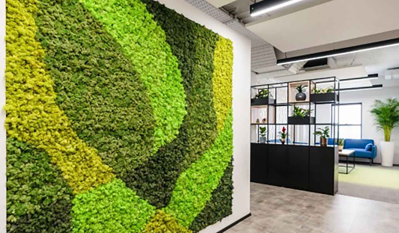
Biophilic Greens
Sage, moss, and forest greens are more than fashionable—they mirror nature’s restorative effects, boosting wellbeing and reducing anxiety. Green zones work beautifully in break areas or wellness rooms.
Digital Blues & Moody Dusk Tones
Teals, navy, glacier-leaning blues and dusky purples blend digital clarity with calm sophistication—great for brainstorming zones or executive suites.
Warm Sunset Yellows & Terracottas
Mustard yellows, terracotta oranges, and sunset corals sparkle in creative hubs—energising, optimistic and mood-lifting without feeling overwhelming.
Deep Accent Hues & Colour Drenching
Rich burgundies, oxblood tones, and bold monochromes are being used for immersive, brand‑aligned accent walls—when balanced with light and texture, they lend drama without heaviness.
Designing with Colour: Psychology Meets Purpose
Sygnus’ colour‑forward approach begins long before paint is chosen. We align four principles:
1. Function by Zone
Each space has its purpose—and colour should echo that:
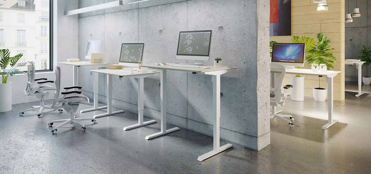
- Focus zones: calming blues or soft neutrals to sharpen attention.
- Collaboration/creative spaces: warm yellow or terracotta for energy.
- Quiet rooms: sage or moss green for rest and renewal.
- Reception and brand spaces: neutrals with bold brand accents to set the tone.
2. Balanced Implementation
Sygnus follows the 60‑30‑10 rule: dominant neutral base, secondary mid-tone, and accent pop for colour harmony—supporting clarity and reducing overstimulation.
3. Natural Light & Texture
Colour interacts with light. We map daylight flow and pair textures—like boucle panels, wood, or metal—to enrich depth and avoid monotony .
4. Brand Alignment
Beyond mood, colour strengthens identity. Sygnus customises palettes to echo brand personality—be it energetic oranges for start‑ups or grounded neutrals for professional services.
Real-world Impact: Colour Shaped for Success
Let’s paint a picture:
- Sales & front‑of‑house teams benefit from energising zones with subtle reds or oranges to spark communication and urgency.
- Tech & finance departments thrive in blue-toned control rooms where calm and cognitive performance are both priorities.
- Innovation hubs come alive with sunset yellows or terracottas that encourage bold thinking and joyful collaboration.
- Wellness spaces embrace soft greens and mauves, crafting restorative atmospheres reflecting a 2025 emphasis on mental health.
These aren’t trends—they’re data-driven colour interventions tailored to real business outcomes.
Colour as Culture: Beyond Aesthetics
Incorporating thoughtful colour strategies elevates more than mood—it nurtures a culture of care, diversity, and belonging. Consider the subtlest breaks: a warm mauve focus room might speak a gentle message of psychological safety. A terra‑cotta lounge area subtly cues relaxation and togetherness. These carefully considered choices communicate deeply felt values—without words.
Sygnus also helps clients train teams to understand this visual language—so staff intuitively feel the difference, day in and day out.
Planning Your Colour Strategy with Sygnus
Here’s how Sygnus brings vision into vibrant reality:
- Discovery & Workshop: We learn about your brand, operations, and people. We co‑create the palette.
- Light & Material Analysis: Assess daylight, artificial light, textures and finishes.
- Mood‑Boarding & Prototypes: We produce full‑scale samples and mood environments for client sign‑off.
- Integrated Design: Colour flows through walls, ceilings, furniture, fabrics and accents—never superficial.
- Implementation & Fine‑Tuning: On‑site adjustments ensure colour works in reality.
- Post‑Occupancy Feedback: We measure well‑being and productivity metrics, iterating if needed.
This is colour as craft—rooted in research, shaped by design intelligence, delivering measurable impact.
Colour in the workplace is far from superficial—it’s strategic. It influences how we feel, think, and perform. In 2024–2025, leading organisations are harnessing colour psychology to craft environments that support human flourishing and brand storytelling.
Sygnus Office Partnership turns colour insight into immersive, meaningful design. From functional zone colour‑zoning and brand‑aligned accents to mood‑supporting textures and lighting interplay, we create offices that look and feel aligned with purpose and performance.
Ready to colour your workspace for success? Connect with Sygnus today. Let’s discuss your office dream and how we can bring it to vibrant life—because when colour works with your people and your brand, creativity blooms, productivity follows, and culture thrives.
#WorkplaceDesign #ColourPsychology #OfficeProductivity #InteriorDesignStrategy #EmployeeWellbeing #FutureOfWorkspaces
Tagged as: